I came across the book below on NetGalley and while there looks like a lot of sad tones to the premise, the themes sound powerful. I wonder if it will live up to its expectations? Hmm…adding it to my reading pile because I’ve enjoyed Hart’s stories in the past!
My 30-day Mixed Media Art Challenge ended a few days ago and I still need to blog about it. Hoping to this coming Monday. This weekend will be busy and I still need to upload some images to my computer. I look forward to sharing the pieces from that challenge! Have a great Thursday! -Stephanie Hopkins
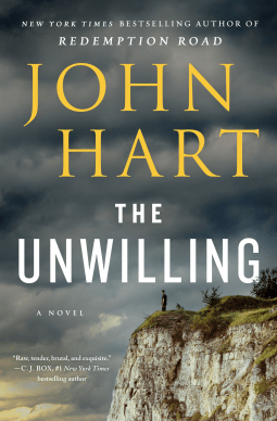 The Unwilling by John Hart
St. Martin’s Press
General Fiction (Adult)
Pub Date 02 Feb 2021
Description
Set in the South at the height of the Vietnam War, The Unwilling combines crime, suspense and searing glimpses into the human mind and soul in New York Times bestselling author John Hart’s singular style.
Gibby’s older brothers have already been to war. One died there. The other came back misunderstood and hard, a decorated killer now freshly released from a three-year stint in prison.
Jason won’t speak of the war or of his time behind bars, but he wants a relationship with the younger brother he hasn’t known for years. Determined to make that connection, he coaxes Gibby into a day at the lake: long hours of sunshine and whisky and older women.
But the day turns ugly when the four encounter a prison transfer bus on a stretch of empty road. Beautiful but drunk, one of the women taunts the prisoners, leading to a riot on the bus. The woman finds it funny in the moment, but is savagely murdered soon after.
Given his violent history, suspicion turns first to Jason; but when the second woman is kidnapped, the police suspect Gibby, too. Determined to prove Jason innocent, Gibby must avoid the cops and dive deep into his brother’s hidden life, a dark world of heroin, guns and outlaw motorcycle gangs.
What he discovers there is a truth more disturbing than he could have imagined: not just the identity of the killer and the reasons for Tyra’s murder, but the forces that shaped his brother in Vietnam, the reason he was framed, and why the most dangerous man alive wants him back in prison.
This is crime fiction at its most raw, an exploration of family and the past, of prison and war and the indelible marks they leave.

 I spent a couple Summers with my Grandparents when I was in my teens. I have fond memories of that time I had with them. They had a vegetable garden out back. My Grandmother and I would pick all sorts of veggies, sit on the back porch snapping green beans, and enjoying the outdoors. Often, we would spend time in her quilting room and I loved exploring all the wonderful textiles and vintage thread spools she had collected over the years. My mom told me that blue was my Grandmother’s favorite color. That would explain all the blue fabrics I have from her. This page has a piece of her fabric from her stash I inherited. The memories came flooding back as I adhered the fabric on the background. Cherish the time you have with your family and hold tight to the good memories. -Stephanie Hopkins
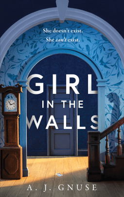 The Cover: I’m crazy about the color blue! That is what first caught my attention about this cover. I might have design the cover layout itself a little different to give it a more Gothic feel to it. The cover almost looks Cartoonist to me. Having said that, I love the color, as I said above, the wallpaper, arch way and the clock! The cover has actually inspired me to create an art piece using some influence of the layout.
 A Weekend of Art
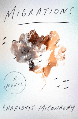
 The background and the image of the pocket watch grabbed my attention. I love textures and the depth it gives the cover. The premise looks pretty intense and with themes that hit close to home during this time but its important to read about history, humanity and survival.
 My thoughts:
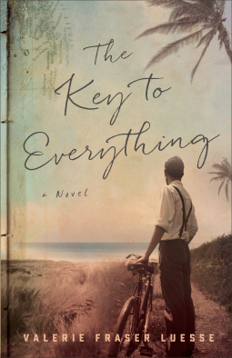 I love vintage images and this one is really atmosphereic. I like reading period pieces and this one looks good even though it has a sad tone to it in the description. The genre is romance and I normally don’t read those kind-of stories, but I will be keeping my eye on this one. -Stephanie Hopkins
 Creating this page was more about having confidence in my art journey. To trust my process and growth in creating from the heart. Trusting myself to be authentic, and to reach further in my exploration of art.