Two in One Talk About Books

Today I’m doing a two in one post about titles that stand out to me and a cover crush. I know. Usual for Layered Pages but fun! When browsing books to choose to read, one can’t help but be drawn in by unique books titles. There are times I feel that the title alone is what draws my interest and want to discover its meaning. Strong titles are important to the story as are the cover designs.

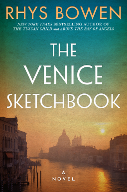
Several of these books could easily be my cover crush choice but I need to pick just one for today. Hmm… I’m going to go with, “The Venice Sketchbook” by Rhys Bowen. I love the blend of colors and the romantic feel to the landscape. The title immediately caught my attention because of the mention of a sketchbook. That word alone draws in intrigue, stories, imagery, a window to the owner’s mind and secrets captured on paper. I obtained a copy from the publishers through NetGalley and I can’t wait to dive into the story!

About the book:

The Venice Sketchbook

Lake Union Publishing

Pub Date 13 Apr 2021

Love and secrets collide in Venice during WWII in an enthralling novel of brief encounters and lasting romance by the New York Times bestselling author of The Tuscan Child and Above the Bay of Angels.

Caroline Grant is struggling to accept the end of her marriage when she receives an unexpected bequest. Her beloved great-aunt Lettie leaves her a sketchbook, three keys, and a final whisper…Venice. Caroline’s quest: to scatter Juliet “Lettie” Browning’s ashes in the city she loved and to unlock the mysteries stored away for more than sixty years.

It’s 1938 when art teacher Juliet Browning arrives in romantic Venice. For her students, it’s a wealth of history, art, and beauty. For Juliet, it’s poignant memories and a chance to reconnect with Leonardo Da Rossi, the man she loves whose future is already determined by his noble family. However star-crossed, nothing can come between them. Until the threat of war closes in on Venice and they’re forced to fight, survive, and protect a secret that will bind them forever.

Key by key, Lettie’s life of impossible love, loss, and courage unfolds. It’s one that Caroline can now make right again as her own journey of self-discovery begins.

*********

Other titles that stand-out and in the coming weeks I will be talking a bit about why I’m interested in them. Each title is linked to Amazon.

The Lost History of Dreams by Kris Waldherr

The Cabin at the End of the World by Paul Tremblay

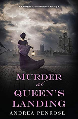
A Betting Woman (A Novel of Madame Moustache)

by Jenni L. Walsh

The Straits of Treachery by Richard Hopton

Be sure to follow and check out more of my art at my Instagram!

before the second sleep cover crush

Stephanie Hopkins

Images may be subjected to copyright. In order to use art images or any content on Layered Pages platform, please ask permission from Stephanie Hopkins

Index Card Challenge: Part 14

The Index Card Art Challenge 2020 is going by so fast! Today, I’m sharing part 14 of this challenge which entails days 88-95. This challenge is just about completed!

Most of the materials I am using for these cards are my painted collage papers I make on a regular basis. I’m also using magazine clippings and images from old books for collage. As well as Tim Holtz and other artists ephemera you can purchase online or at craft stores.  Many of these cards will be used for my 2021 Journals. Others I want to either frame for make another art piece out of them using the collage method.

The images with three cards (Day 92) was a special series I painted inspired on a morning stroll from the previous day. I had taken lots of photos of landscapes, beautiful shrubbery and wanted to use colors I saw depicting our walk. The colors are so vibrant! Really pleased how they turned out and they have given me inspiration for other art pieces. They would look fantastic in frames!

There are several challenge days you can choose for this challenge and I chose 100 days. Check out Part 13 post in this challenge HERE, where I include more details of this art adventure.

Be sure to follow and check out more of my art at my Instagram!

Stephanie Hopkins

Images may be subjected to copyright. In order to use art images or any content on Layered Pages platform, please ask permission from Stephanie Hopkins

Art in Motion

This post is the first in a series that will explore confidence in your art, expectations, encouragement and finding your style in creating your own master piece.  Today I’m discussing about when you get stuck on a piece and you’re not sure how break down that barrier.

Don’t force the process. If you’re not feeling it, take a step back and examine what you’ve created thus far. Or come back to your piece at a later time. You’ll be amazed when stepping back builds your self confidence in what you are creating. People tend to give up too easily and throw out their art piece and give up. Don’t fall into that trap.

When you come back to it, put aside expectations and enjoy the journey of each layer you add to your art. Be in the present of mind and never doubt the outcome. You’ll learn and grow with each piece of art you create. -Stephanie Hopkins

Other Related Post Link:

What Are Warn and Cool Colors?

Abstract Impressionism

My latest pieces will feature some of the influences of Abstract Impressionism. My fascination for layers, texture and the depth come from this form of art from many artists I have studied over the years. No only that, but from patterns and colors I observe in nature and how they coincide with each other. Later on, I will be discussing further about my interest in the medium, the artists that inspire me and when I first discovered my passion for Abstract Impressionism.

This past Thursday, Georgia had a wicked storm come through and over a million people were out of power. Of course, that was the day I had planned on starting new art pieces. The lighting was poor in my art area so I eventually moved my panels to the kitchen island. I am working with Birch and MDF Boards and I have begun the first layers of three and prepping the others with Gesso. The third piece is not shown in these pictures. Have a blessed weekend! -Stephanie Hopkins

The definition of Abstract Impressionism according to Wikipedia: “Is an art movement that originated in New York City, in the 1940’s.  It involves the painting of a subject such as real-life scenes, objects, or people (portraits) in an Impressionist-style, but with an emphasis on varying measures of abstraction. The paintings are often painted en plein air, an artistic style involving painting outside with the landscape directly in front of the artist. The movement works delicately between the lines of pure abstraction (the extent of which varies greatly) and the allowance of an impression of reality in the painting.”

Be sure to follow and check out more of my art at my Instagram!

Images may be subjected to copyright. In order to use art images or any content on Layered Pages platform, please ask permission from Stephanie Hopkins

What Are Warm and Cool Colors?

I’ve had several people ask me about how I blend my colors without the colors coming out muddy. That is an excellent question. Three things to remember: Know which colors are warm colors and cool colors. Know which colors not to blend together at the same time. Allow drying time between the layers of warm and cool colors. I recommend downloading or purchasing a color wheel as a guide.

Often times I get asked what is my favorite color. Asking a painter or crafter what their favorite color is, is like asking a book worm what their favorite book is. There usually isn’t just one favorite color or book. If we broke it down to cool and warm colors, I would have to say that currently Magenta and Lake Blue are the colors of choice for a few of my current projects. Having said. Lately I have been working a lot with Blues, and Greens. They represent Earth, Ocean and Sky.

If you’re unsure about what colors you want to start painting with, a good idea is to go for a walk and observe the colors around you. What colors are your eyes drawn to? If you are not able to go out-doors, pick up a magazine or look at your surroundings and observe the colors. Soon you will begin to notice depth and patterns for inspiration.

What are cool colors?

Greens, Blues, and Purples are considered cool colors with variations. Blue is the only primary color in the cool category.

What are warm colors?

Reds, Oranges and Yellows are considered warm colors. Red and Yellow are primary colors.

Once you learn how they react to each other, you will be able to create wonderful depth with the colors.

When working with colors-especially acrylic paint-it is always best to have White paint on hand. If the color you are working with is too vibrant-like an Orange color-you can add a little white to it to soften the hue.

In the near future, I will talk about neutral colors.

Be sure to follow and check out more content at my Instagram!

Have a beautiful, creative weekend!

Stephanie Hopkins

Index Card Challenge: Part 13

The Index Card Art Challenge 2020 is going by so fast! Today, I’m sharing part 13 of this challenge which entails days 81-87.

Most of the materials I am using for these cards are my painted collage papers I make on a regular basis. I’m also using magazine clippings and images from old books for collage. As well as Tim Holtz and other artists ephemera you can purchase online or at craft stores.  Many of these cards will be used for my 2021 Journals. Others I want to either frame for make another art piece out of them using the collage method.

There are several challenge days you can choose for this challenge and I chose 100 days. Check out Part 12 post in this challenge HERE, where I include more details of this art adventure.

Be sure to follow and check out more of my art at my Instagram!

Stephanie Hopkins

Images may be subjected to copyright. In order to use art images or any content on Layered Pages platform, please ask permission from Stephanie Hopkins

Awareness Within Ourselves

Good morning, afternoon and evening depending where you are in the world! This year has brought so many changes in the world, including social media. With the lockdowns, people are utilizing the net in increasing rates, I believe. I know that is a no-brainer but lately is has me thinking about how one uses time and mindfulness. What is important, what content one puts out there and the influences it creates. Whether they are positive or negative influences.

I guess the point I’m getting at is that it is important to create a habit of mindfulness in all aspects of our lives. In everything we do and say. That extends to social media as well. Awareness and self-control are a powerful state of being. Is there a feeling, emotion, or thought process you would like to change? Everyone has them. Most time we get so caught up in them, we don’t realize how it is affecting us and those around us.

More thoughts to share on this topic next week.

Stephanie Hopkins

Cover Crush: Murder at Queen’s Landing by Andrea Penrose

Murder at Queen’s Landing is part of the Wrexford & Sloane Series by Andrew Penrose. I must admit I have not started the series as of yet but I’m keeping a close eye on it. Today, I am highlighting this particular book because I absolutely love how the cover evokes hauntingly imagery. This cover would make a beautiful painting.

There are many elements to this story that interest me. Not only the cover but the genre and the time period the story is set in.  A theme that really stood out to me is the, “World of banking and international arbitrage.” The world banks wield unspeakable power that the majority of the populous is completely unaware of that fact. I have a feeling this is an interesting story to say the least and I’m curious as to where the author goes with this. -Stephanie Hopkins

Book description:

Murder at Queen’s Landing (Wrexford & Sloane #4)

by Andrea Penrose

Published September 29th 2020 by Kensington Books/Kensington Publishing Corp.

The murder of a shipping clerk . . . the strange disappearance of trusted friends . . . rumors of corruption within the powerful East India Company . . . all add up to a dark mystery entangling Lady Charlotte Sloane and the Earl of Wrexford in a dangerous web of secrets and lies that will call into question how much they really know about the people they hold dear—and about each other . . .

When Lady Cordelia, a brilliant mathematician, and her brother, Lord Woodbridge, disappear from London, rumors swirl concerning fraudulent bank loans and a secret consortium engaged in an illicit—and highly profitable—trading scheme that threatens the entire British economy. The incriminating evidence mounts, but for Charlotte and Wrexford, it’s a question of loyalty and friendship. And so, they begin a new investigation to clear the siblings’ names, uncover their whereabouts, and unravel the truth behind the whispers.

As they delve into the murky world of banking and international arbitrage, Charlotte and Wrexford also struggle to navigate their increasingly complex feelings for each other. But the clock is ticking—a cunning mastermind has emerged . . . along with some unexpected allies—and Charlotte and Wrexford must race to prevent disasters both economic and personal as they are forced into a dangerous match of wits in an attempt to beat the enemy at his own game.

Be sure to follow and check out more content at my Instagram!

Stephanie Hopkins

Images may be subjected to copyright. In order to use art images or any content on Layered Pages platform, please ask permission from Stephanie Hopkins

Dream Builder

“Whether you succeed or not is irrelevant, there is no such thing.  Making your unknown known is the important thing.” – Georgia O’Keeffe

You want to create art with paints and all sorts of mediums but you don’t know where to begin or you’re afraid that you’ll mess up? Guess what? You can’t mess up. Create what you love. Below are some tips on how to leave that self-doubt in the dust.

Tips to create:

Don’t think too much about it.
Learn by experimenting.
Don’t pay attention to what others think.
Validation comes from within.
Get messy.
Tear into your paper.
Lose all self-doubt.
Free your mind.
Have fun.
You got this!

Next week I will be talking a little about colors.

Be sure to follow and check out more of my art at my Instagram!

Stephanie Hopkins

Images may be subjected to copyright. In order to use art images or any content on Layered Pages platform, please ask permission from Stephanie Hopkins

The Index Card Art Challenge 2020: Part 12

The Index Card Art Challenge 2020 is going by so fast! Today, I’m sharing part 12 of this challenge which entails days 76-80.

Most of the materials I am using for these cards are my painted collage papers I make on a regular basis. I’m also using magazine clippings and images from old books for collage. As well as Tim Holtz and other artists ephemera you can purchase online or at craft stores.  Many of these cards will be used for my 2021 Journals. Others I want to either frame for make another art piece out of them using the collage method.

There are several challenge days you can choose for this challenge and I chose 100 days. Check out Part 11 post in this challenge HERE, where I include more details of this art adventure.

Be sure to follow and check out more of my art at my Instagram!

Stephanie Hopkins

Images may be subjected to copyright. In order to use art images or any content on Layered Pages platform, please ask permission from Stephanie Hopkins